
Beer Project
Logo, product, packaging design.
Objective
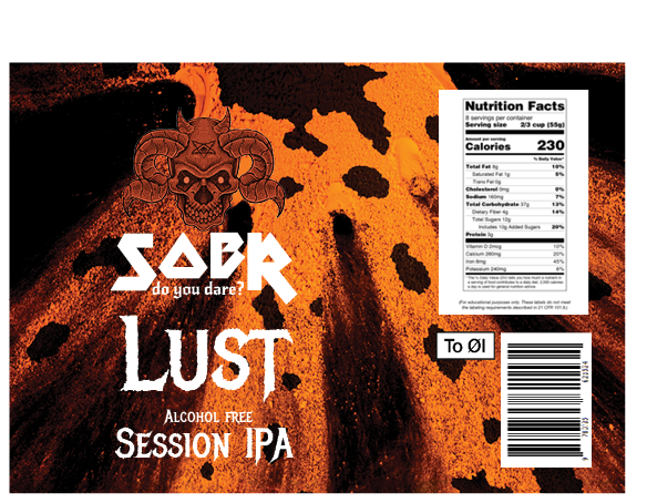
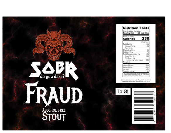
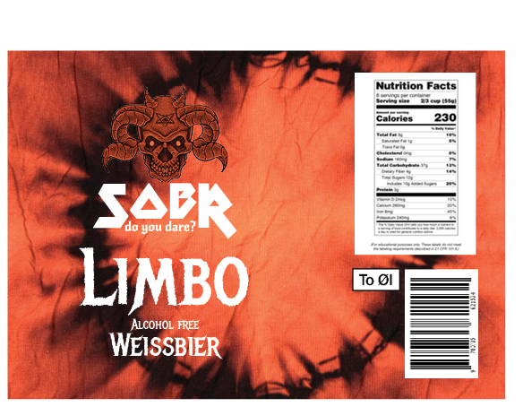
SOBR is an alcohol-free wheat beer created as part of a packaging and branding project. The goal was to develop a full visual identity that challenges how we think about non-alcoholic products — making sobriety feel bold, modern, and confident.
Workflow
1. Research & Insight I explored trends in alcohol-free branding and found that many designs felt soft or apologetic — I wanted to go in the opposite direction.
2. Concept Development I came up with the name SOBR — short, bold, and visually striking. The payoff “Do you dare” challenges the viewer’s expectations.
3. Moodboard & Visual Style I built a moodboard with sharp contrasts, bold typography, and minimalistic layouts to reflect confidence and clarity.
4. Logo & Typography The SOBR logo is designed to feel clean and powerful. The type choice supports the daring, no-nonsense tone of the brand.
5. Color Palette Selection I chose a reduced, modern palette that gives the design edge — avoiding typical “soft” colors often seen in alcohol-free products.
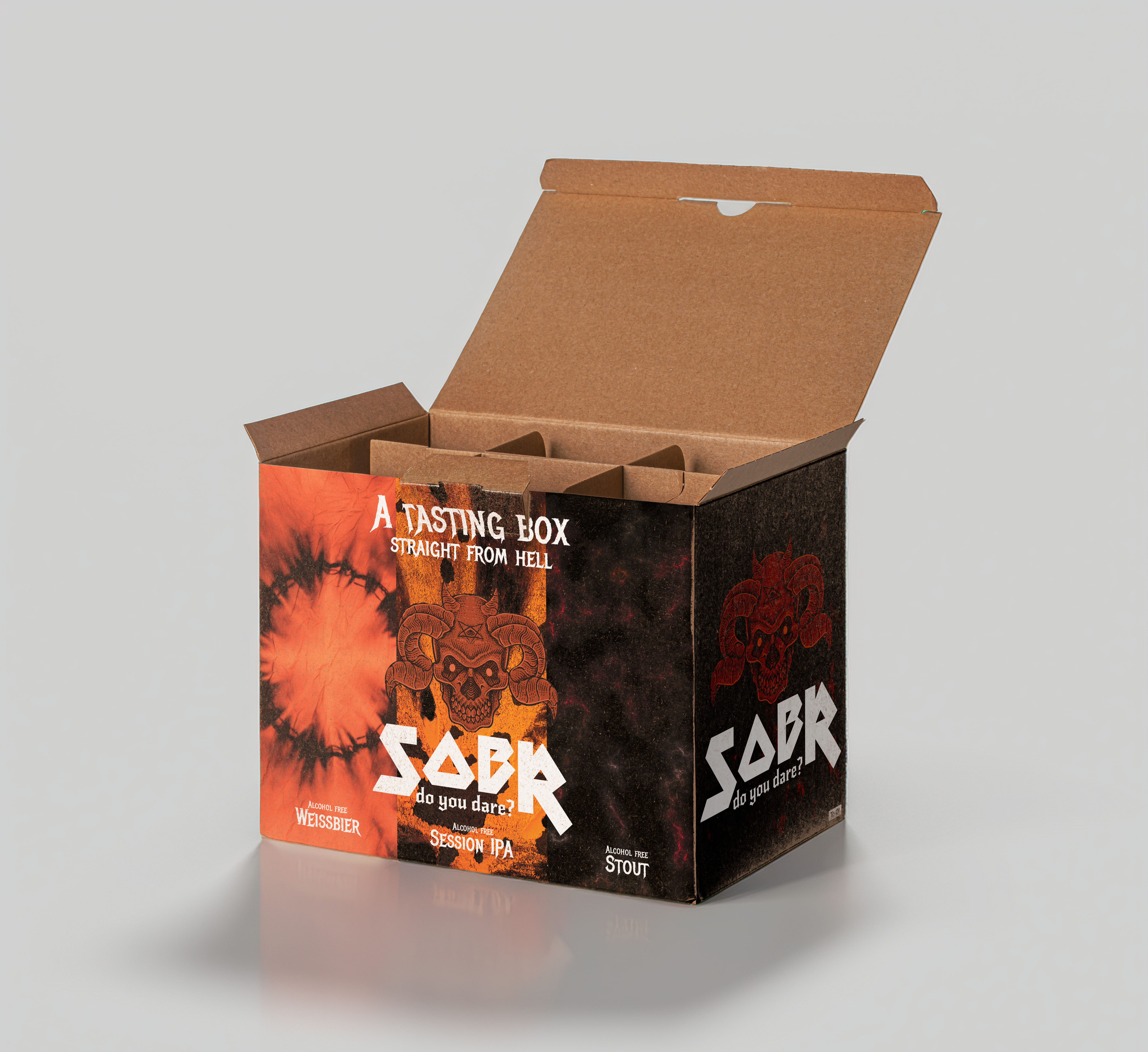
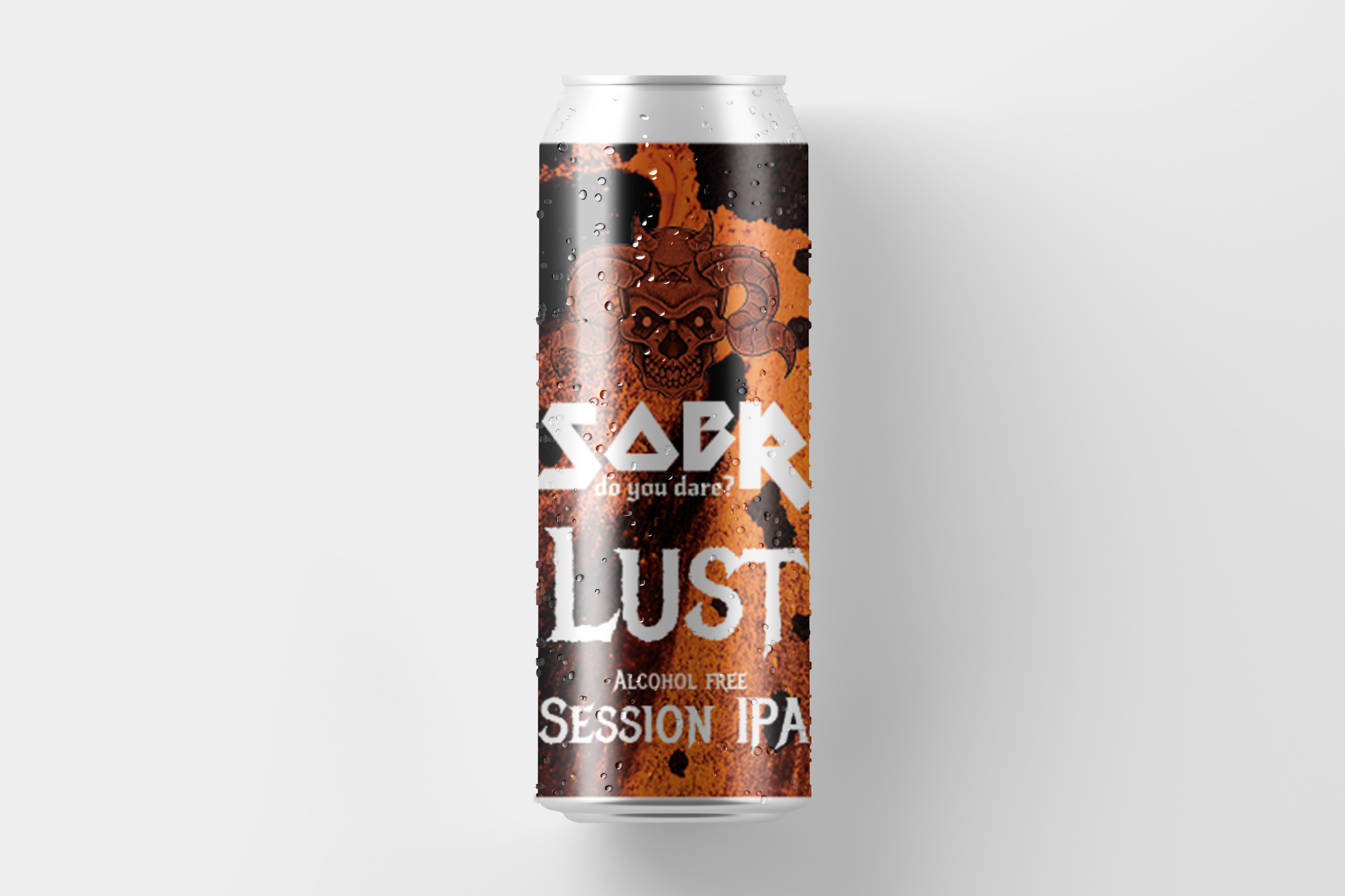
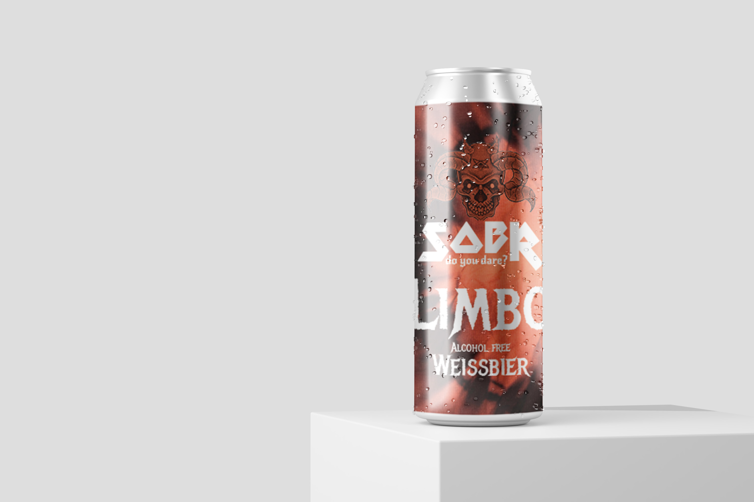
6. Brand Expansion The visual identity was extended across packaging, mockups, and social content — ensuring the tone stayed consistent everywhere.


Creative Process
The project started with research into alcohol-free beer branding. I noticed many designs felt soft or generic, which led me to explore a more bold and confident visual direction.I sketched logo ideas and experimented with clean typography and strong contrasts to develop a visual identity that felt modern and daring.Using Illustrator, I created the logo and can design, and built mockups in Photoshop to visualize the final product. I focused on simplicity and clarity, making sure every element supported the core concept — a confident alcohol-free brand.
Results
The final result is a sleek and minimalistic can design with a bold typographic logo and sharp layout. The design communicates confidence and clarity, standing out among typical alcohol-free packaging.The payoff “Do you dare” challenges the viewer to rethink what sober can look like — not boring or bland, but strong, modern, and intentional.
Conclusion
SOBR was a chance to rethink how branding can shape perception — especially around products that are often overlooked. The project allowed me to dive into conceptual thinking, design execution, and visual storytelling.It reflects my creative approach: clear ideas, bold design choices, and a focus on building identities that say something.